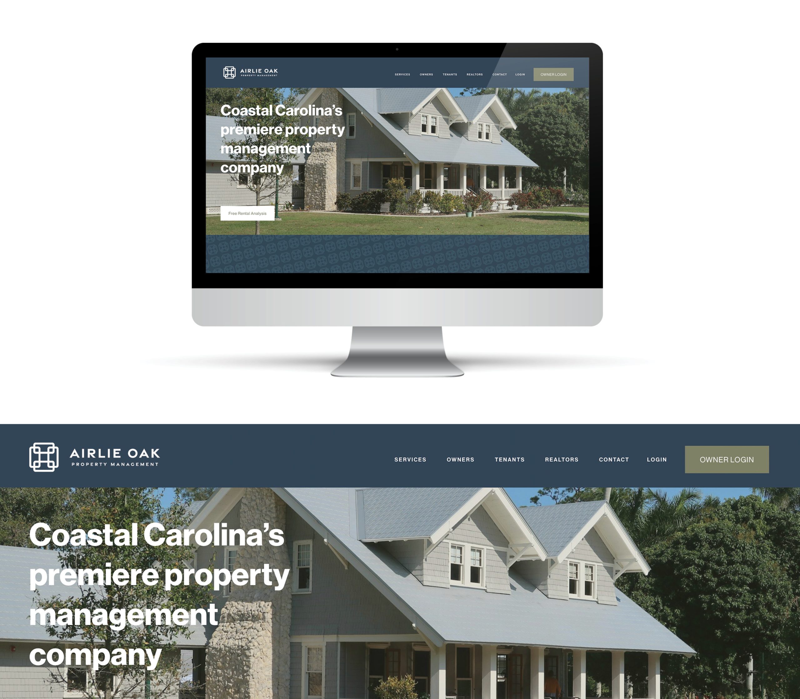
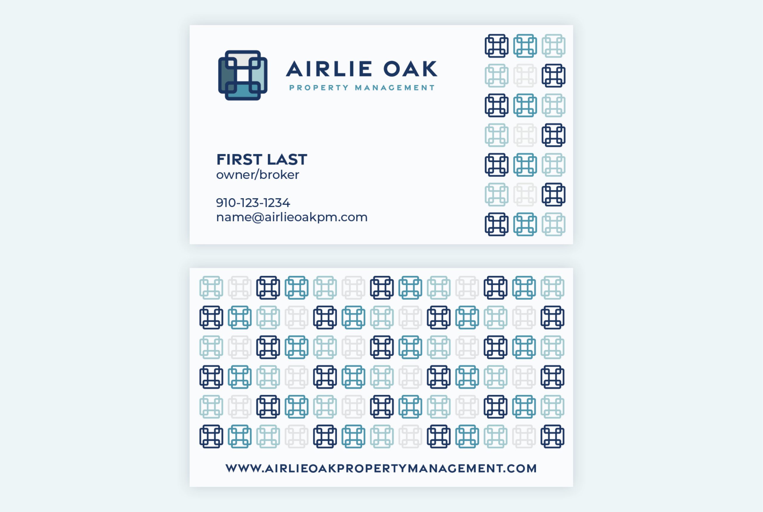
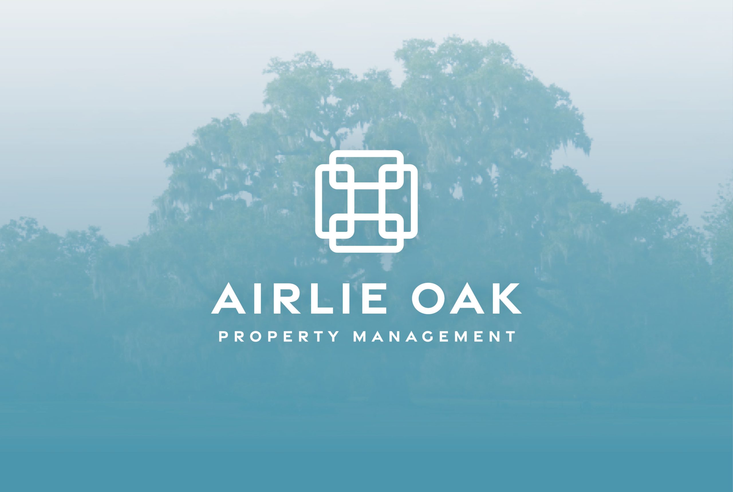
Airlie Oak Property Management
Logo and branding design for Airlie Oak Property Management, based in Wilmington, North Carolina. The original logo concept centered around stylized doors, referencing the “lock and leave” nature of vacation and second homes. The color palette draws inspiration from the nearby ocean and coastal environment, while the oak tree—an iconic local symbol—anchors the name and adds a sense of place and longevity. The result is a mark that feels both welcoming and dependable, tailored to a property management brand rooted in community and care.